Brief
- Project Name: Caricature
-
- How is the project in keeping with the course outcomes?
-
-
- The caricature keeps in line with the course outcome by having us both study the form of ourselves, and use our artistic licensing to exaggerate certain parts.
-
- How will this project be in keeping with the PSLOs?
-
-
- This project makes us as students use our knowledge of figure drawing and learn how to adjust and exaggerate different aspects to create a caricature. This helps us still keep in mind how the human body works while using creative arts styles.
- Project Summary
-
- You are to research, reflect, and design a caricature of yourself.
-
- Design Process: 1) initial written response of your idea you want to communicate (Tone, Message and Style) and initial half-size sketches of images, 2) research of other Caricature artists, 3) readdressed rough draft with enriched ideas, 4) refined idea as to what you want to achieve, 5) refined full-size rough draft, 6) feed back from others on 2nd or 3rd rough draft, 7) tweaking of final image to be submitted and final product, presentation, and a written response to the critique of your work.
-
- Design Process is shown: idea generation written and initial sketches, research of related projects.
-
- A written response to critique, design language to illustrate artistic choices, how it fits with course outcomes and the PSLOs you expanded upon and your growth as an artist noted citing specific examples.
-
- Project parameters: two images: 11”X 14”, mediums: ink (pen) and one digital, software: Illustrator or Photoshop.
- Objective
-
- To create a caricature of myself using other caricature artists as inspiration for the style. This must be inked on an 11″x14″ piece of bristol board and colored digitally and printed on 11″x14″ paper. When determining my success, I would say that a caricature that has both good craftsmanship and expresses a sense of fun energy would be a successful caricature.
- Target Audience
-
- Alfred State College, classmates, sophomores, juniors, seniors, and faculty.
- List of Deliverables
-
- Brief
-
- Documented MLA
-
- Design Process recorded (with all rough drafts)
-
- Link to file pertinent to this image
-
- Final images and detail of final images
-
- Write up
-
- All on WordPress before the critique
- Competition Identified
-
- For my caricature, I would like it to be reminiscent of ones from ones created by street artists and Mort Drucker, the illustrator of MAD Magazine. To do this, I need to exaggerate certain features. This I generally ones that are more iconic to my person, like my mouth since I am quite the talker.
- Details of Tone, Message and Style
-
- I, myself, am a very fun and quirky person. Since this is a caricature of myself, I wanted to create a caricature that is just as fun and quirky as myself. This is why I chose Mort Drucker’s art style as an inspiration for me.
- Time Line
-
- 30 January- Preliminary Sketches due
-
- 4 February- Both inked and colored illustrations due, brief and project summary
- Budget
-
- Time- 10 hours
-
- Materials- Bristol Board, Micron, Photoshop
-
- Grade- A
- Key Stake Holders
-
- Alejandro
-
- Jacob
-
- Max
Project Summary
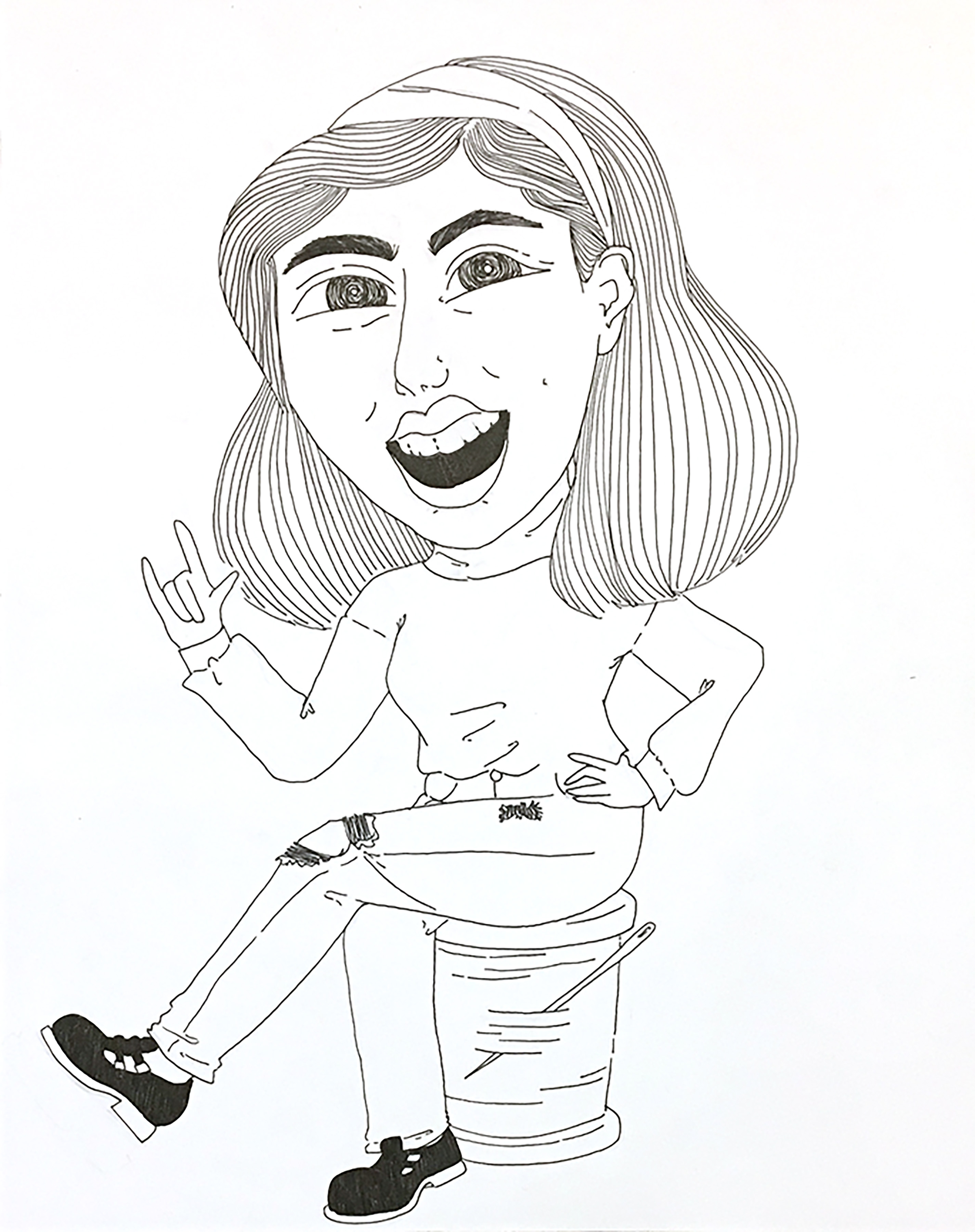
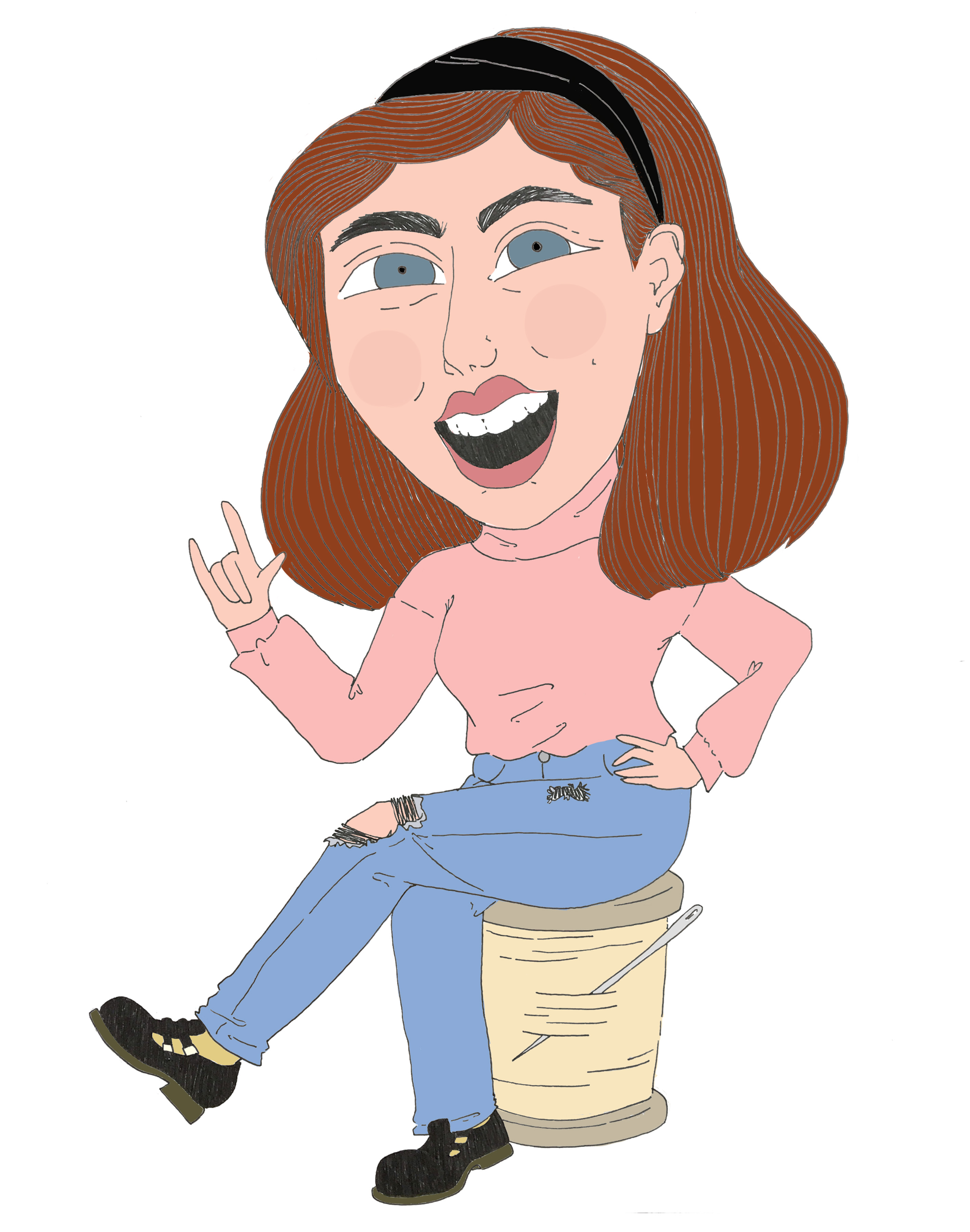
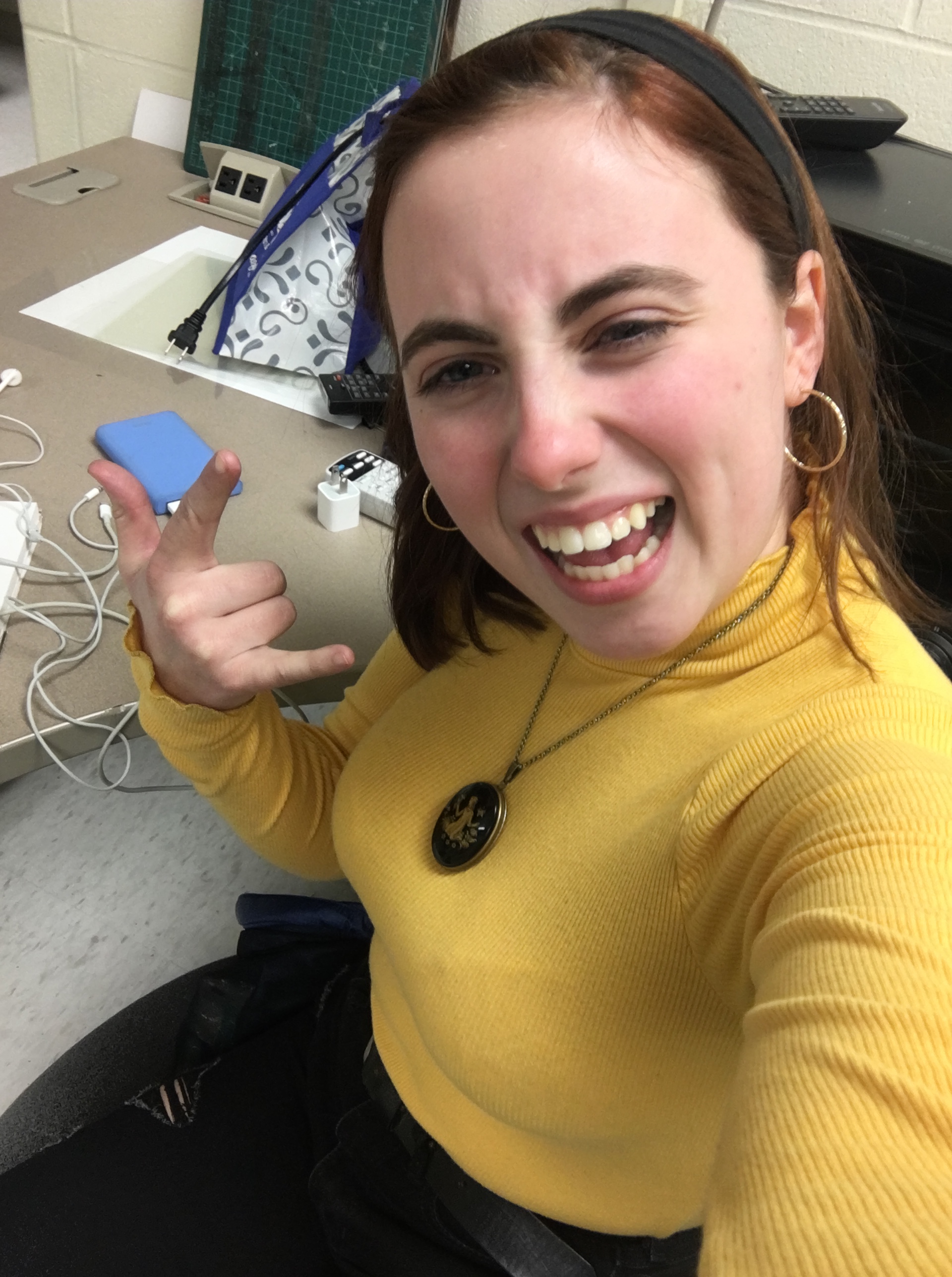
For the caricature, I had to create a self-portrait that was inspired by at least one famous caricature artist. Since I consider myself someone who has a fun and energetic personality, I went towards Mort Drucker’s art style. Mort Drucker is most famously known for satirical illustrations in MAD Magazine. The style is similar to those from street artists, where the characters look a lot like the people they are based on but certain characteristics are exaggerated.
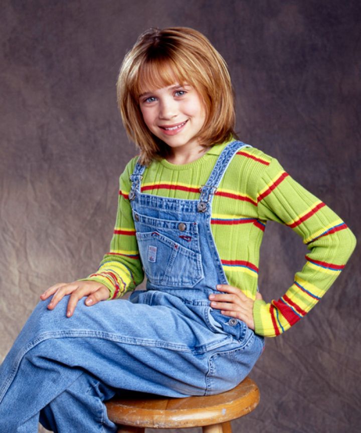
Once set on Mort Drucker’s style, I began to do some preliminary sketches. Most of the sketches were just of my head, however, I decided in the end to do my full body. I wanted a really stereotypical 90s pose, so I ended up using either Mary-Kate or Ashley (the image I used did not indicate which one) as a reference. I think that and the photo I took of myself created a really fun and entertaining end product.
When it came to the materials, I had to use 11″x14″ Bristol board with ink. Originally, I was going to use my dip pen and black ink. However, I soon learned that my ink had dried shut and I could not use it. I instead used my 05 black micron. I then took the finished inked piece into Photoshop to color it. Overall I think that the end product came out very well, however, I do wish my dip pen could have worked because I think it would have created more lively lines.
The end product is quite nice. The tone I was aiming for is displayed, the line work is solid, the coloring is consistent, and the caricature looks like an exaggerated version of myself.
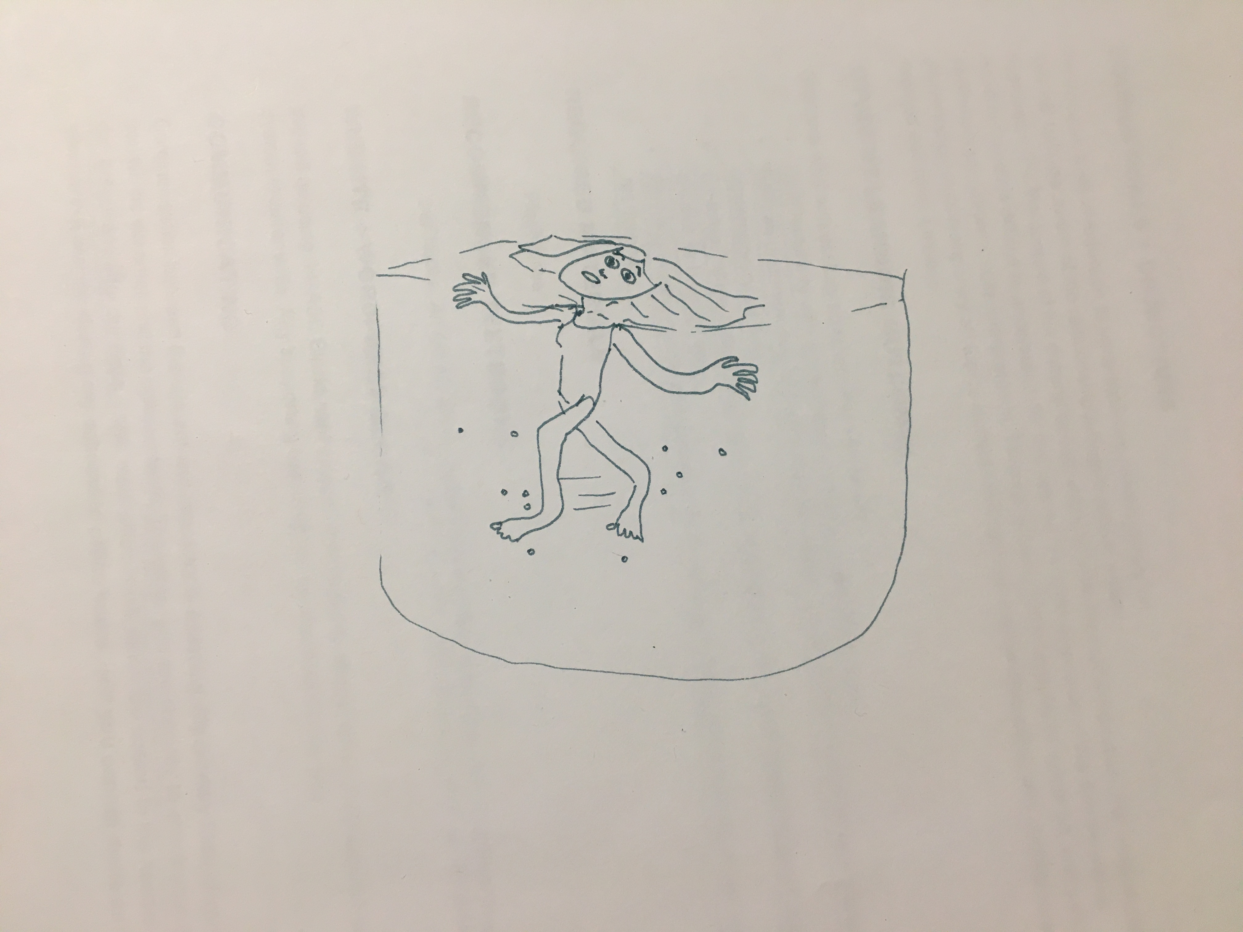
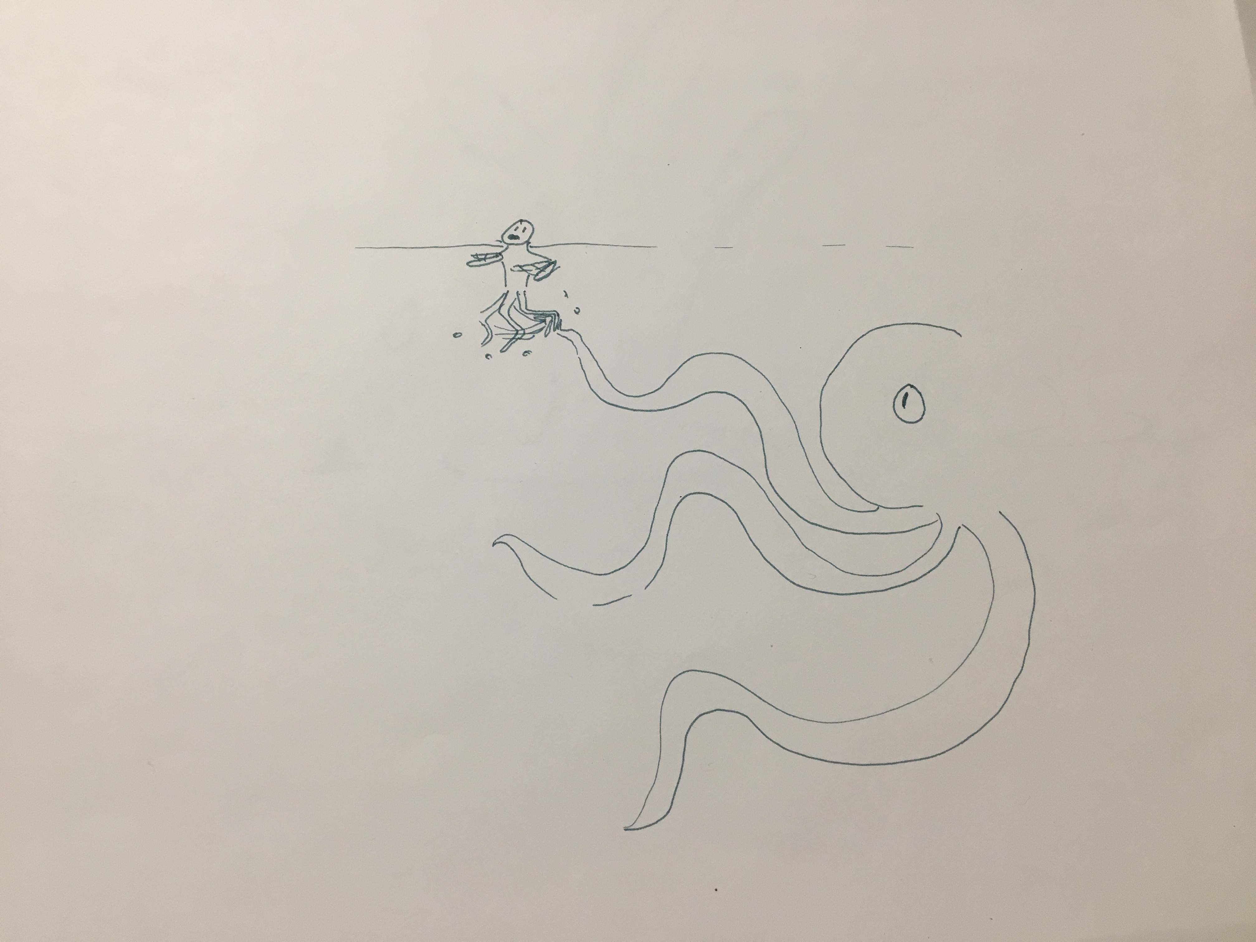
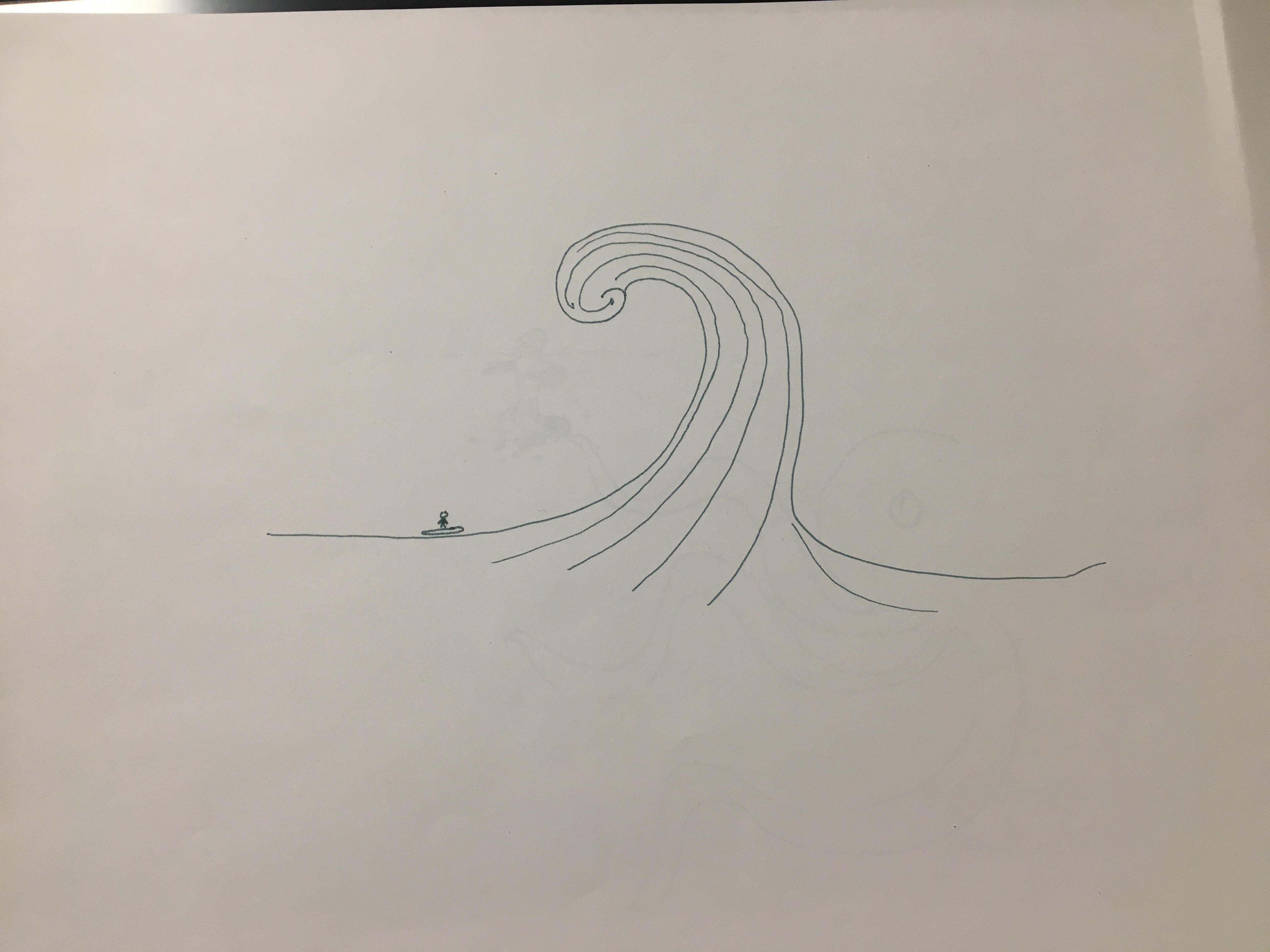
Preliminary Sketches and Basic Line Art
Photo References
“How To Wear ’90s Trends The RIGHT Way”, Refinery29. Alyssa Cosarelli. Refiner29. 30 June 2015. https://www.refinery29.com/en-gb/how-to-wear-90s-trends.
 Illustration.Blogspot. Mort Drucker.http://illustrationart.blogspot.com/2005/04/mort-drucker.html.