
For this assignment, we had to create an animation using the rigid body simulation.

Typography: Graphic Designer Poster
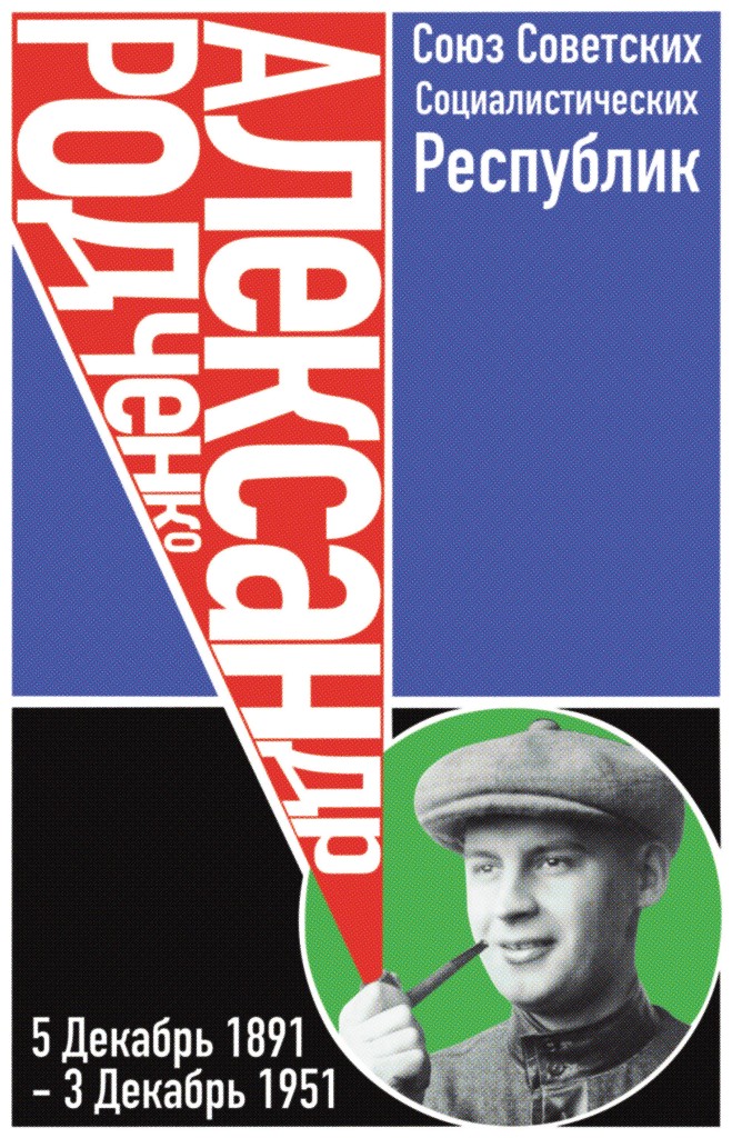
For this assignment, we were assigned to create a poster inspired by a historical graphic designer.
I chose Alexander Rodchenko, a famous designer from the Soviet Union, who led the constructivism movement. I was really drawn to his use of geometrics, photography, and color. I was particularly inspired by the piece below.

Overall, I find this piece was very successful. The color and geometry in my piece are similar to the original without being a direct copy. Though I couldn’t find the exact font that Rodchenko used, I also found that the one I found worked well enough.
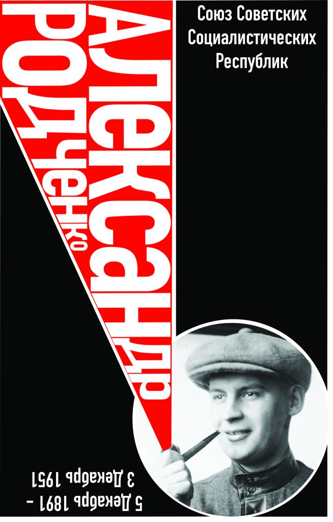
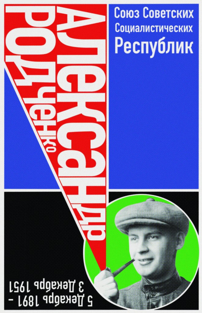
Rough Drafts

Advanced Motion Graphics: Take Your Pills
This project was created in Cinema4D.
For this project, we were asked to create a 10-second animation focusing on whatever we’d like. I particularly enjoyed using plastic and metallic textures during previous projects this semester, so for this last assignment, I knew I wanted to use the same.
The topic of “take your pills” is kinda a self care reminder that I thought would be fun to create an animation around, but doesn’t have a lot of meaning besides that.
Though the animation is not perfect, I am still fairly proud of it as the overall aesthetic is exactly what I was aiming for.
Note: This took me a total of 4 full days to render. In the future, I will make sure not to have any unnecessary deformers or simulators so the render won’t take as long.

Typography: Samizdat


What is a samizdat?
A samizdat is a type of publication, much like a zine, that was used predominantly in communist Russia and its surrounding territories to spread information that the author thought was important. It particularly contained information that could be seen as controversial by the government at that time.
Intention for Project
For the final project for the typography class, we had to create a samizdat about a topic we particularly cared about. I decided to focus on the multiple mass genocides that the Late Ottoman/ Early Turkish government has been covering up and ignoring for the last 100 years.
I chose this topic because of my family connection to the genocides (my great-grandfather was a survivor) and the fact that many of the early samizdats were about human rights.
Thought Process
When coming up with the design, I really wanted to focus on making the samizdat look handmade and unpolished. That eventually developed into trying to recreate a sense of grunge design.
Another major part of the aesthetics of the piece was to poke fun at the Turkish government and comment how ridiculous it is to continually ignore their own actions. In a way, I wanted the samizdat to be like a political cartoon. However, it was extremely important to me not to make the images of the survivors and victims into something humorous.
Despite the difficulties these specific details caused, I think I created a really solid piece that has a lot of emotion and information in it.
Programs
Indesign
Photoshop
Image Pack
Indieground Ransom Note Letters Pack
Resources
I got most of my information from these sites:
https://www.greek-genocide.net/index.php
https://www.bbc.com/news/world-us-canada-56874811
https://www.armenian-genocide.org/genocide.html
https://www.britannica.com/event/Armenian-Genocide

Senior Studio I: Earthworm Graveyard
Synopsis
A young worm rises to the surface and discovers a world entirely new to him. He discovers a patch of flowers but soon finds that the journey to get there may be more treacherous than he first thought.
Pre-production
Programs
Procreate
I used Procreate mainly in the pre-production process. This was where I created my concept art, character designs, storyboard/animatic art, background art, and title card.
ToonBoom Harmony 20
I used Harmony for the hand drawn animation. This was my first time using this program and though there was a bit of a learning curve to it, I found it and overall productive experience.
After Effects
I used After Effects to create the rain effect that is seen through the majority of the animation. This made my job much easier and made the overall project feel more complete.
Premiere Pro
I used Premiere to stitch the seperate scenes together and create the finalized video. This is also where I did the editing for my audio.
Title Card

Animatic
Background Art


Character Designs


Concept Art


Mood Board

Typography: Exercise 1

I recreated this using a larger dpi in procreate. I still think the rasterization it a bit much, so I will continue to look into how to do it with vectors.

In this exercise, we were instructed to create an object using words that describe the object.
I chose to recreate my water bottle. I accomplished this by creating a list of words in illustrator and then created an object trace around them. I adjusted the text into the shape of the bottle by adjusting the height and curvatures. I originally planned to mask an image of my bottle onto the words in illustrator, but it was too complex so I took it into procreate and then created the mask there.

Production II: Project IV: Meditative Moments
Meditative moments that I found around the area as I became lost in nature.


Motion Graphics: Title Sequence
Sequence
Bumpers

Production II: Project III: Archetypes- Temptress Trope
Final Video
The concept for my video changed and deviated from its original intent. Based on the current climate on our campus with assaults, I decided that a comedical and light hearted interpretation of the temptress trope was no longer acceptable. Instead, I created a critical video essay of the trope and dissected its affect on our culture.
Despite this last minute change, I felt that this final version was exactly what I wanted it to be.
Midway Point
Background & Character Designs


Mood Board

