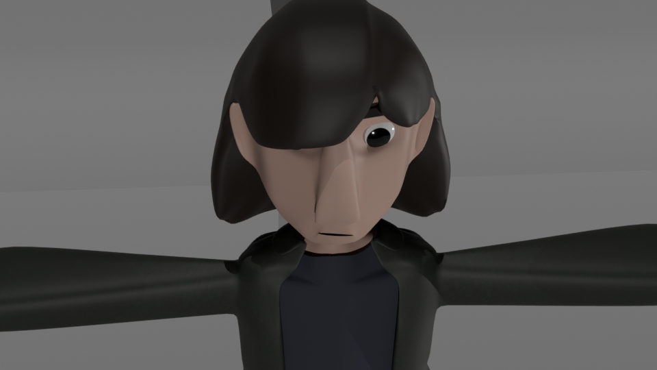
Typography: Exercise 1

I recreated this using a larger dpi in procreate. I still think the rasterization it a bit much, so I will continue to look into how to do it with vectors.

In this exercise, we were instructed to create an object using words that describe the object.

I chose to recreate my water bottle. I accomplished this by creating a list of words in illustrator and then created an object trace around them. I adjusted the text into the shape of the bottle by adjusting the height and curvatures. I originally planned to mask an image of my bottle onto the words in illustrator, but it was too complex so I took it into procreate and then created the mask there.

Motion Graphics: The History of Where are the Black Designers Advocacy: The 50 Year History

Yesterday on 8th of February 2021, I was lucky enough to sit through a lecture by Cheryl D. Miller. There, she spoke about her life in the field of graphic design and the history behind representation of black designers.

It’s a bit embarrassing to admit but prior to this presentation, I really was not aware about the movement that has been going on in the field of design over the past 60 years. I am aware of the latter end of the movement that is currently going on social media like Instagram but I didn’t know anything that happened at RISD in 1970 or Miller’s paper Black Designers: Missing in Action.

Over the decades, the most important action taken to elevate the voices of black designers is to just admit they are there and they are being ignored. Prior to any action taken, black designers existed. They didn’t just crop up when they were told they were allowed to be artists. This is clearly shown by the students at RISD when they created Black Artists of Graphic Design and in Miller’s paper. Especially since Miller herself was and is a black designer. From there, the next move is just getting these artists recognized.

In the modern day, the efforts of representation is to post about these people. There are many accounts online who repost works (particularly with credit) and I have found many of them are trying to make sure that the works the post are of a diverse background. This gives a lot of people publicity and a larger following. Though this doesn’t always promise more professional work for them in the future, it can heighten their popularity and worth to a future company.

For the future, I can do a lot to help black designers by showing that I want them in the field. I can support their work through social media and commissions as well as work with companies who have a diverse group of designers. By doing that, those companies and others will hopefully see that it does make a difference and that they need to hire workers who have different experience. Black designers are import for two main reasons:

  1. They are human being like anybody else and each individual deserves a fair chance in the field of design.
  2. A black designer may find solutions to problems in a different way that does not occur to a white designer. Many people have different experiences and exposure due to the cultures they grew up in.

Overall, I am really happy I got hear from someone as influential as Cheryl D. Miller. Seeing her and hearing about her life story makes all of this more real and make me realize just how recent all of this change has been.

Illustration: Adobe Max

Summary

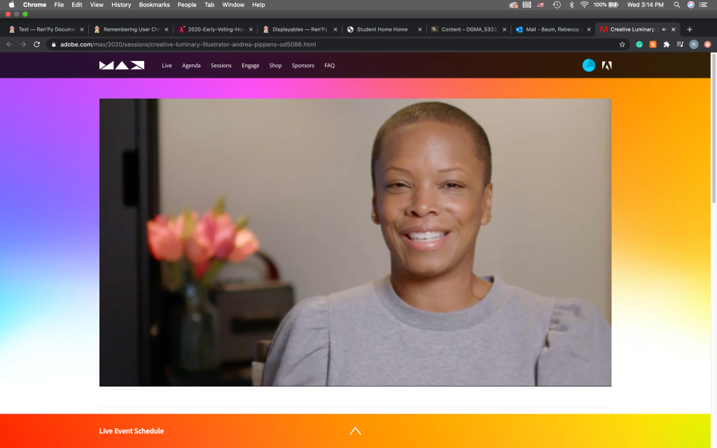
The three conferences that I watched were extremely informative. I often find that I have a difficulty creating pieces for my own personal work, and listening to how passionate these three artists are kinda invigorated me. They all had different kinds of passions that drove their art, whether it was to create for themselves or others.

I found it particularly profound when Andrea Pippins discussed needing to know about who you are within to truly create something of your own. This was very similar to Aurelía Durand about having a cause to create for. I found that these two women really knew who and what they are and I want to have a passion like that. Andrea also mentioned a lot about journaling to self-reflect and I think I want to do that as well.

All of these illustrators had beautiful work but I would have to say that Charlie Davis’s work was my favorite. Not only does he try to grasp the memory of a place, he also attempts to create the best overall feeling of it. Though that is not necessarily the intent of my own work, I do really appreciate that in others’ work. I consider what feeling I want my audience to feel when they view my art.

Overall, these conferences almost gave me an existential crisis but a well needed one. I need to challenge myself more in what I create but I never really knew how to do so. I feel like after seeing and listening to some experienced illustrators, I have a new sense of invigoration inside of me.

Screenshots

Andrea Pippins: Author and Illustrator
Aurelía Durand: Celebrating Diversity with Bold Colours
Creative Luminary: Illustrator Charlie Davis

Illustrations: Practice Reading Assignment #2

Saussere’s

Instagram: @ehaidle

In this image, the Chinese and Roman characters are the signifiers of the image of the rat, which is the signified. The characters label the image as a rat, which is confirmed by the image clearly depicting a rat.

Pierce’s

Instagram: @roman_m

In this image, we see a white shirt and tie, a balloon, and a face. The face is an icon for being a face. The white shirt and tie are symbols for a white collar worker. The balloon is an index for a head. This is because the face is on it and it is attached to the shirt. Naturally, we would then allude to the balloon being the head because a head would be attached to the shirt and face.

Connotative and Denotative

Instagram: @wisesnail

In this illustration, we see a portrait of David Tennant as his character Crowley; this is denotative. What we can infer is demons and angst, as these are major characteristics of the character; these inferences are connotative as this isn’t being explicitly explained.

Interactive Design: Online Exhibition: History of Postcards

Summary and Review

For the online exhibit, I decided to look at one that discusses the history and use of postcards in the late 19th and early 20th century, particularly in Brittany. Prior to the exhibit, the only real knowledge I had on postcards was that people would sometimes use them while on vacation to show their loved ones some of the sights they had seen. However, after viewing this exhibit, I discovered that postcards had a variety of uses that would only be about as comparable to that of the modern uses of the internet.

Postcards were first created in 1869 in Germany but soon caught on around the world as an easy way to communicate with friends and family. Not only did postcards often depict art and scenic photos, but they also were some of the easiest ways to share the latest news within hours of it happening. The cards varied from commercial to comical to even pornographic. The messages on these cards were often not long, possibly due to the fact that (at least in Brittany) too long of messages would be taxed and the receiver would have to pay it. Speaking of taxation, certain words and phrases were even taxed!

Though it can be seen as odd for me to have chosen an exhibit about post-cards for an interactive design class, I found that post-cards were the pre-internet internet. These cards were fairly cheap and easy ways of communicating with one another (often used similarly as a slow version of texting) where they could share photos and memes and even advertisements. Their designs were just as important back then as web design is now because if the card did not read well, people were less likely to purchase or use those cards.

Based on some of the cards I saw at the exhibit, these were some of my favorite.

Screen Shot 2020-05-06 at 5.52.33 PM

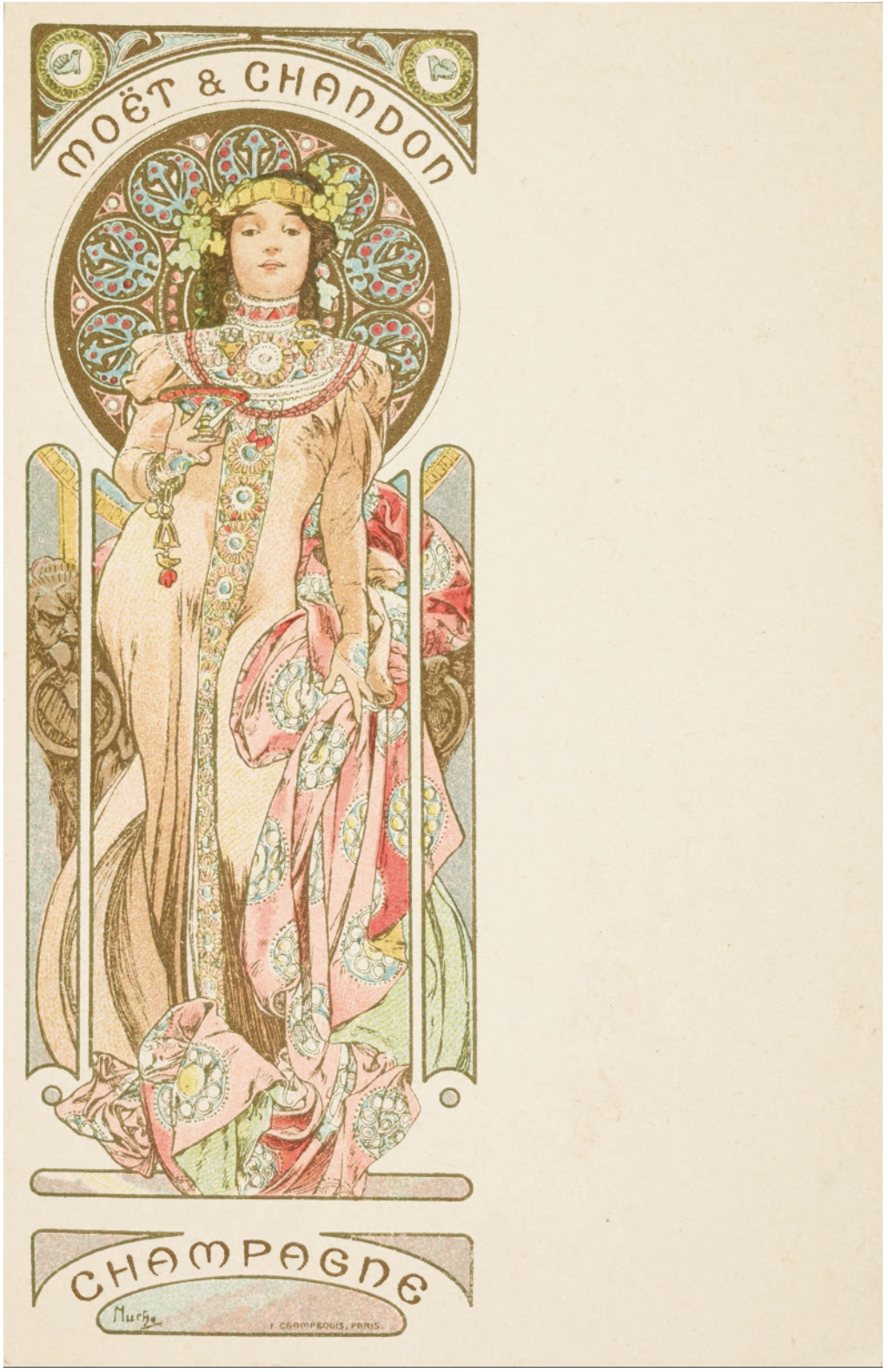
MOET ET CHANDON , CHAMPAGNE

Alphonse Mucha

Screen Shot 2020-05-06 at 5.58.02 PM

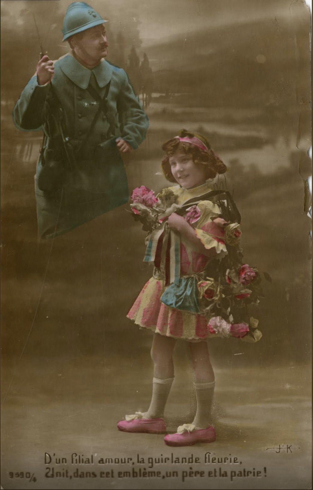
D’une filial amour, la guirlande fleurie, , Unit, dans cet emblème, un père et la patrie !

Screen Shot 2020-05-06 at 6.02.59 PM

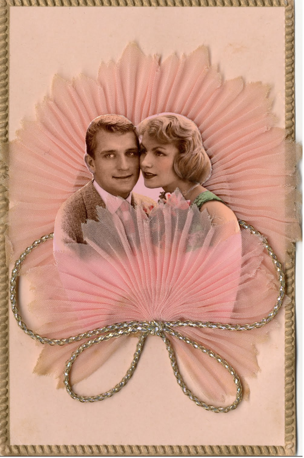
Kitsch

I believe the reason why I particularly like these cards so much is that they show different types of creativity and purposes. The first one appears to be in art nouveau and is advertising some kind of champagne. The second one is some kind of painted film and has something to do with the Great War, possibly to build up morale for the troops. The third is crafted, which in the exhibit was mentioned that crafted cards were often made for special occasions and holidays, and I believe it has something to do with the celebration of this couple like an anniversary.

Link for Online Exhibit: https://artsandculture.google.com/project/postcards?hl=en

3D Design/Color: Curated Museum Exhibition

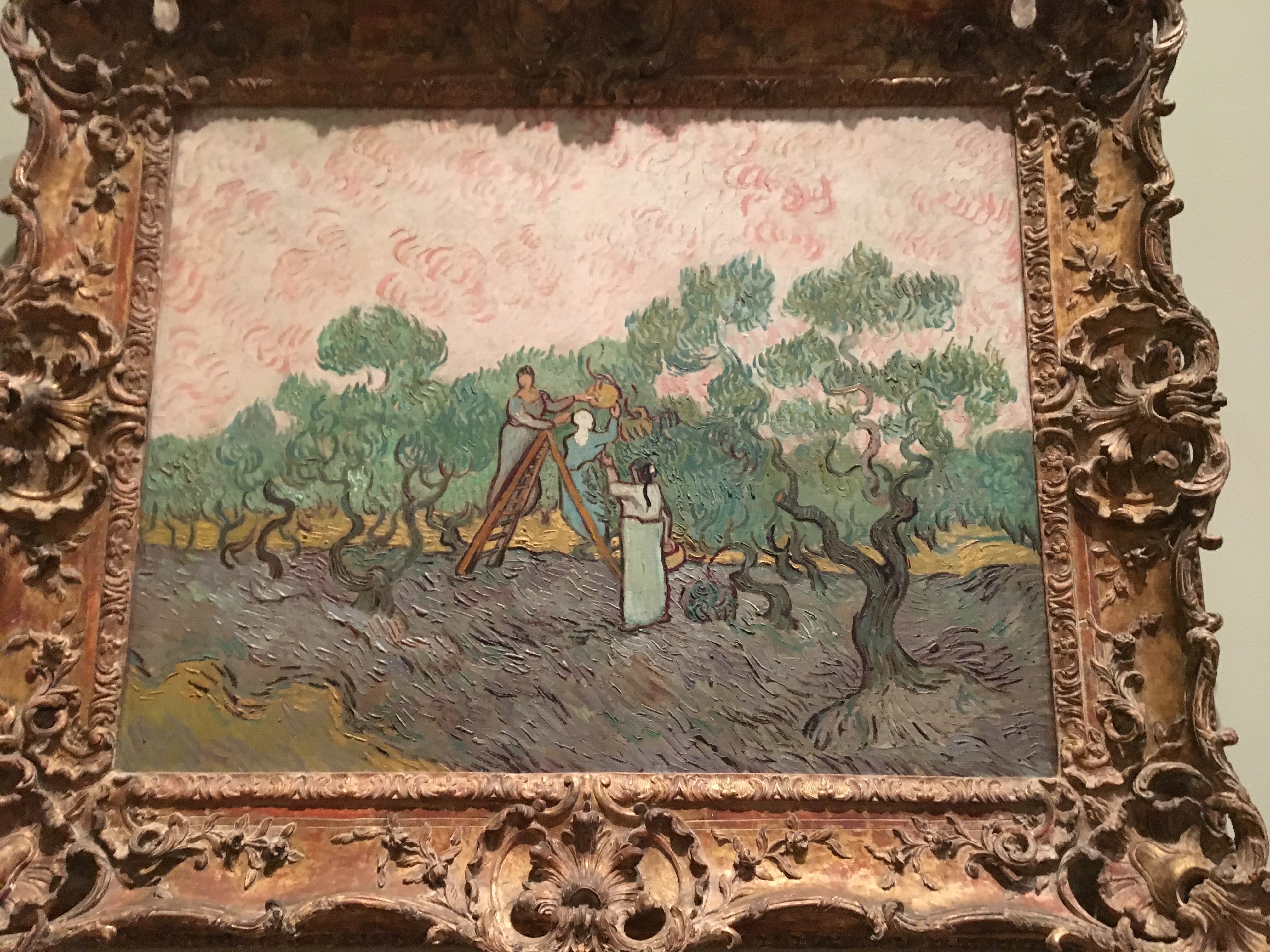
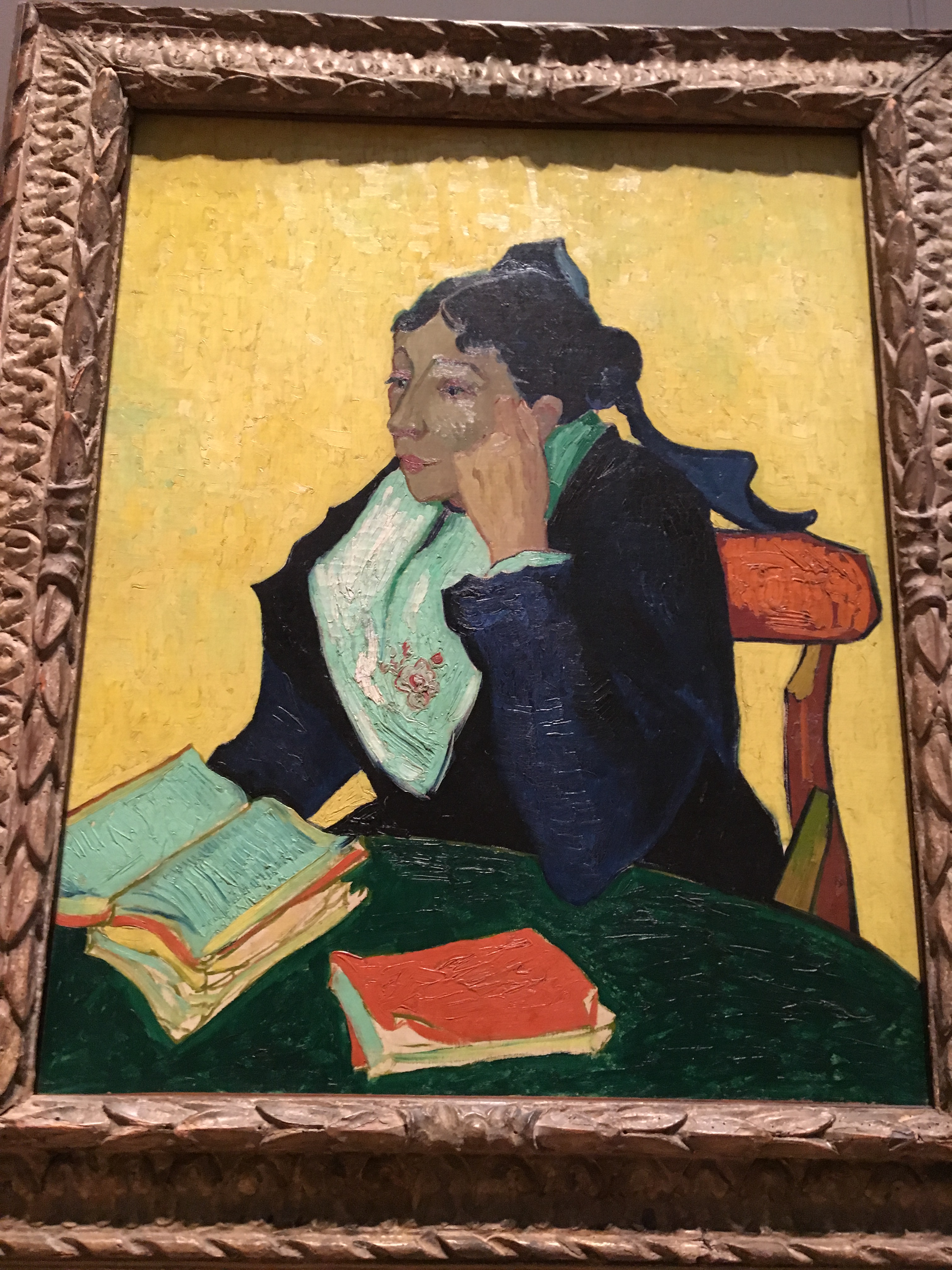
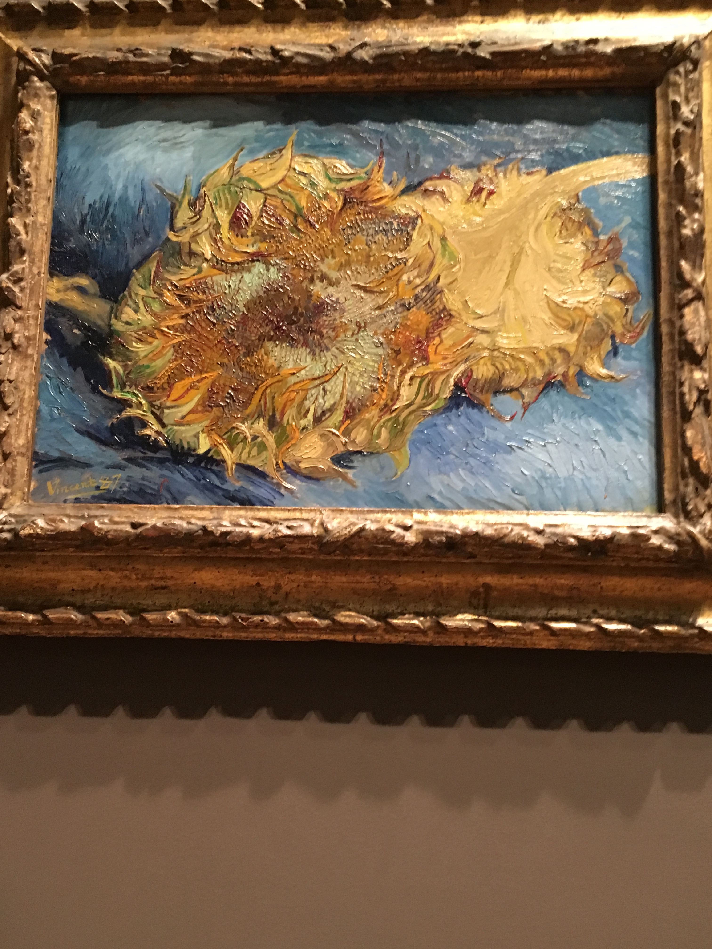
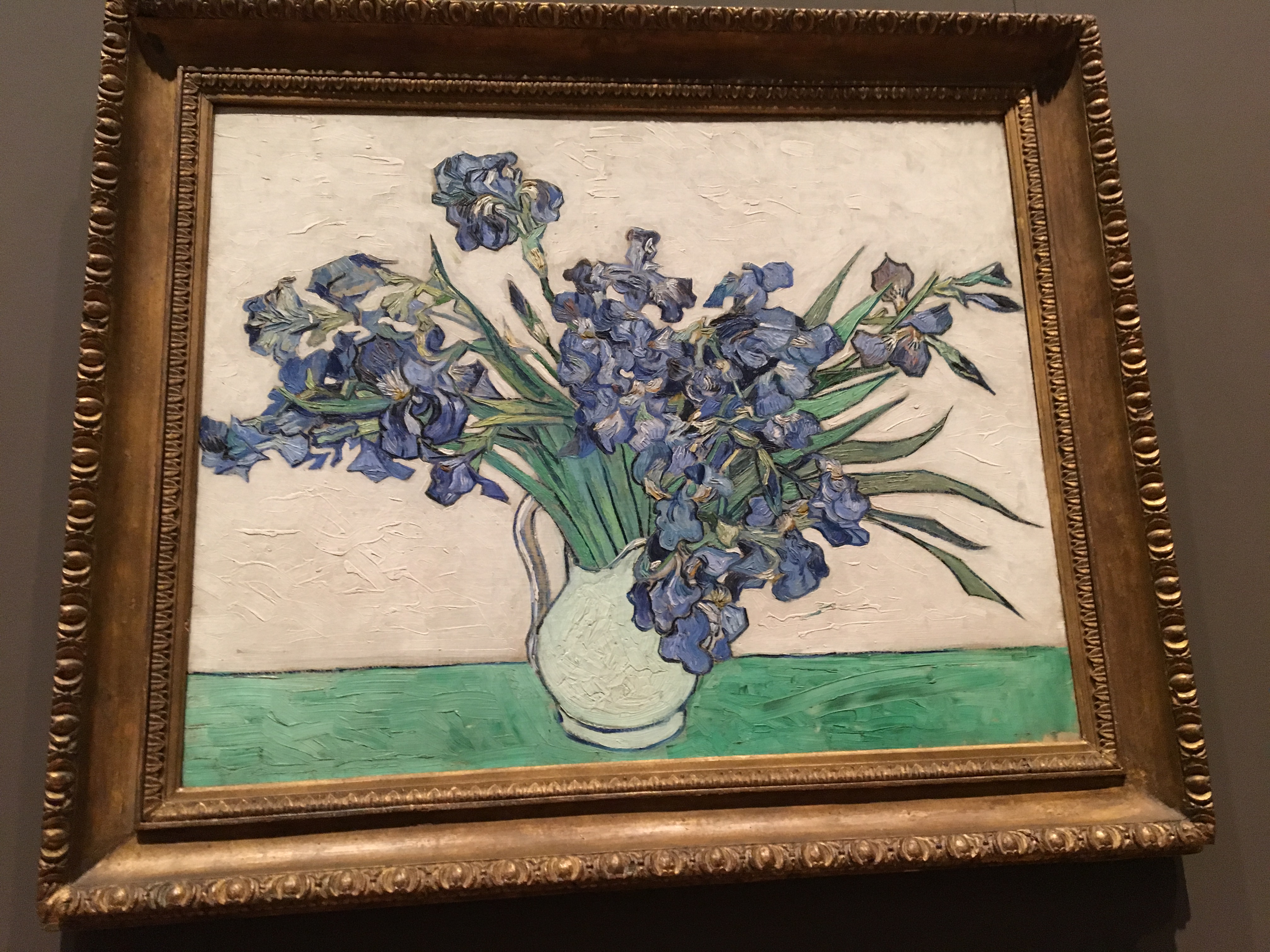
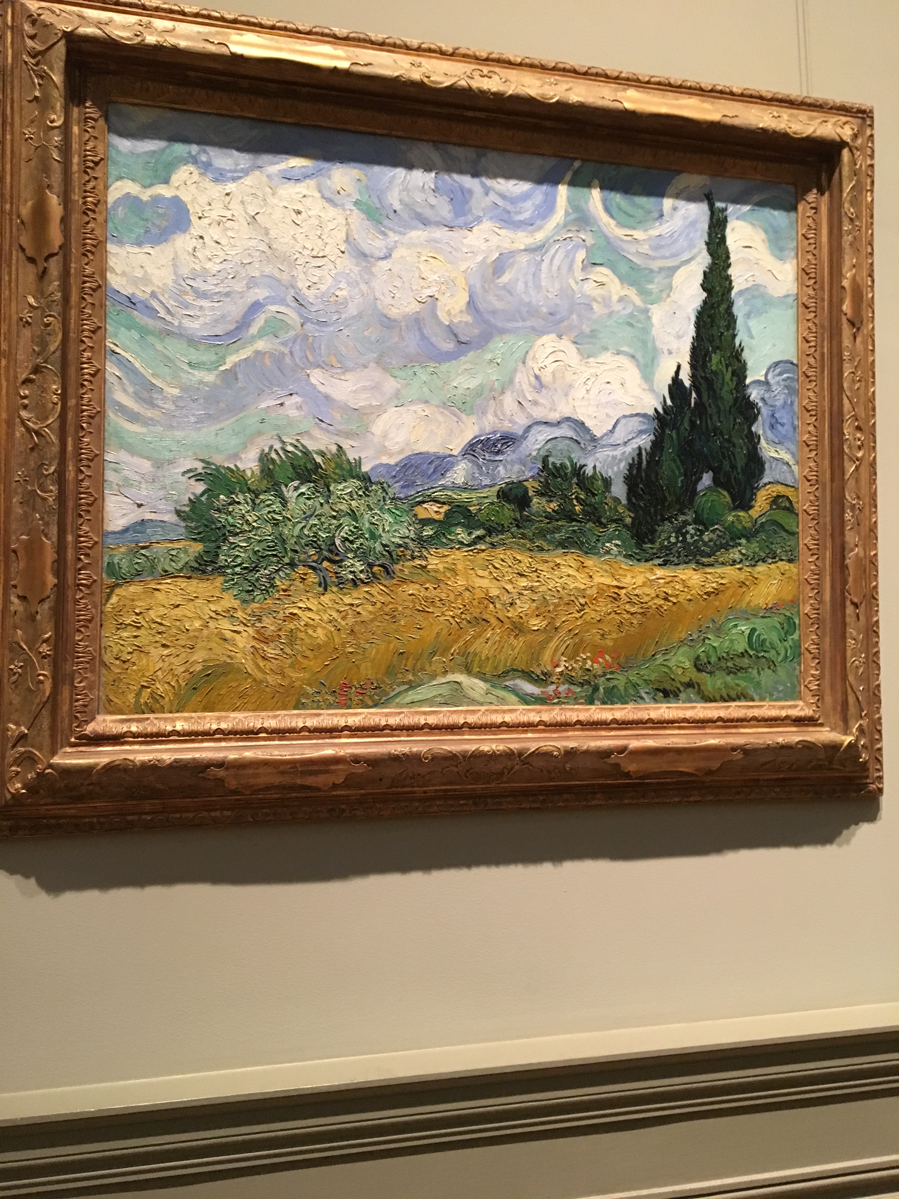
During my winter break, I had the opportunity to visit the Metropolitan Museum of Art. Though it had not been my first time going there, I still got to look at art I had yet to see before. I generally prefer to spend most of my time in the Ancient Greek/Roman area wandering, what I would refer to as, “The Garden of Statues”. However, during this particular visit, I was able to find my way to where the great European pieces of the 19th century were kept. Artists who I either knew or heard of like Seurat and Monet were here, along with some artists who I would later learn to love like Klimt. I remember walking into that room and feeling greatness in the air. I believe this moment was heightened when I saw my first Van Gogh’s in person.

Van Gogh had always been a person whose art I heard of and been exposed to. It is difficult to go through this world, especially as an artist, and not be able to identify Starry Night or Cypresses. But never before in my life had I seen any of the real things. I never thought it was overly important to do so, yet once I got to see them I didn’t regret it. The pieces I saw, in particular, were Wheat Field with Cypresses (1889), Women Picking Olives (1889), Shoes (1888), Roses (1890), Self-Portrait with a Straw Hat (1887), L’Arlésienne: Madame Joseph-Michael Ginoux (1888-89), Sunflowers (1887), and Irises (1890). 
IMG_8496.JPG

IMG_8498.JPG

IMG_8500.JPG


IMG_8504.JPG

IMG_8508.JPG

IMG_8510.JPG

IMG_8512.JPG

IMG_8515.JPG

To see these pieces in real life were extraordinary. I had always known that Van Gogh had an affinity to have a lot of texture in his paintings but to see it really was insane. It was almost difficult not to want to trace my fingers over the brush strokes he had left, especially with Wheat Field and Sunflowers.

Looking at Van Gogh’s art truly was aw inspiring. It put me into something of a melancholy state of mind thinking about how a man who had been able to create so much beauty could take his own life. Though this may be odd to say, it is the same feeling I used to get when I first began listening to Nirvana. To just knowing the fact that the man whose voice I was gaining so much joy from couldn’t find that same joy in himself, and the same goes to Van Gogh. One thing that makes me feel really proud is knowing the fact that though he did not get much attention in his time, Van Gogh’s art was on display in gilded frames next to pieces like The Storm by Pierre-Auguste Cot and Water Lilies by Claude Monet.

Though the entire room wasn’t dedicated to a singular artist, which I find common in many art museums, I don’t believe it retracted the significance of the individual pieces. I feel as though this simplification and evening out of these artists on a basic level of viewing made me appreciate each piece more. It was as though no artist was seen higher than any of the rest. It allowed the viewers to be drawn to whatever piece called to them naturally, as the Van Goghs had done to me. On top of that, the lighting of the room wasn’t overly bright. It was clear enough so I could see the paintings well, but dim and warm enough to be calming. I found this part of the experience nice but did make it a little difficult to take proper photos. If I were to complain about one thing, I remember the paintings being at different heights. Some were more eye level with me, like ones on display in the center of the room, and some were higher and difficult for me to get the best look at. Though I know not everyone is as particular as I am, I would hope there would be a bit more consistency in the flow and layout.

If someone is ever considering to go visit the MET, I would highly recommend visiting this area, particularly for the Van Goghs. They really change your outlook on art history.