


For my two goals in class today, I wanted to create 3 more sketches of ideas that I wanted to use for the upcoming assignment and test out my materials.

As you can see, I was able to finish my 3 sketches during the first session. When I finished them, I decided I really like the third sketch in particular and wanted to see how I can add microns and markers to it.

When I started my second goal, I began sketching and inking different elements from the third sketch that I thought were major focuses and tried hatching them. I also tested out three colors that I thought were fall-ish; these colors ended up being terra-cotta, sienna, and dark brown. Eventually I landed on terra-cotta and dark brown. I was modeling my illustration after the look of the Eloise book illustrations, so I decided to finally add the hatching and color to the sketch. Overall, I like how it came out. Unfortunately I didn’t have enough time to try out digital, though I do feel like I may lean towards the markers and pens anyway.

Saussere’s

In this image, the Chinese and Roman characters are the signifiers of the image of the rat, which is the signified. The characters label the image as a rat, which is confirmed by the image clearly depicting a rat.
Pierce’s

In this image, we see a white shirt and tie, a balloon, and a face. The face is an icon for being a face. The white shirt and tie are symbols for a white collar worker. The balloon is an index for a head. This is because the face is on it and it is attached to the shirt. Naturally, we would then allude to the balloon being the head because a head would be attached to the shirt and face.
Connotative and Denotative

In this illustration, we see a portrait of David Tennant as his character Crowley; this is denotative. What we can infer is demons and angst, as these are major characteristics of the character; these inferences are connotative as this isn’t being explicitly explained.


Over the last 12 weeks or so, I have had to do weekly gesture drawings. In the beginning, it was 35 a week but became 5 detailed a week after week 6. This constant practice of drawing was supposed to help us understand the human figure better. In addition to this, I also found that it helped me draw it quicker and more efficiently. Before the assignment, I have never properly studied human anatomy and though my gesture drawings weren’t necessarily bad, they weren’t as good as I thought they were.
One thing that I think had definitely improved on are my proportions. I can’t necessarily say that if I were to draw a person out from scratch without a reference that the person would look flawless. However, when I look at a person, I can get the proportions fairly accurate. No longer am I getting unusually thin and long limbs. I have also found an improvement in my faces. Though I never did a very detailed face when doing my gesture drawings, the simple layout is beginning to look more structurally correct. If I begin to draw faces in greater detail, I think I will begin to draw more realistic faces.
On the other hand, there are some things that I still need to work on. Not every gesture drawing I did was perfect, no matter what week it was. I think part was due to working on difficult poses that involved a lot of foreshortening and sometimes it was based on body types that I need more work studying. In one case I ended up drawing my friend so poorly she looked closer to Danny Devito than herself. But after that session, I began to make sure that when I was to draw her to be aware that I wasn’t shortening her limbs and body too much.
Though these weekly gesture drawings are done with, I hope that I will continue to more. I found that I benefited from this practice and I’m very proud of this improvement.
Before the beginning of my artist study, I wasn’t very versed in different artists. I have been to art museums plenty of times, but I have never been one to be able to know all the necessary trademarks that made an artist’s work unique. For my study, I looked at past artists from history and even looked at one artist who is currently working today. Though I am not perfectly versed in all artists now, I know I can identify those I did study.
The first artist I studied was Egon Schiele. He was an expressionist artist who was alive from 1890 to 1918. His art, just like his mentor Gustav Klimt was considered risky, often because he showed very exposed nudes. Though his work was much grittier and risky than Klimt, I find that I enjoy his work just as much.
Pablo Picasso, the next artist, was someone I found extremely fascinating. Though Picasso is a very well known artist, I did not realize how much of his art I have seen without realizing it. For most of my life, I had always known Picasso for his Neoclassic style, with eyes and mouths arranged in odd and varying places. But to my surprise, most of his work was not as abstract as I always perceived it to be. I found that I really enjoyed his work in his Rose Period. I love the shades of reds that he used that contrasted from his Blue Period.
Going to the Art Deco movement, I learned about Tamara de Lempicka. She was a woman who lived a crazy and fanciful life, and that’s exactly what I see in her art. Figures that are larger than life, that announce their presence as soon as it is placed in a room. Everything in her art seemed exact and had a reason for being there. Her art was unique, even for her art movement.
Going way back in time to the Renaissance, Raphael was the artist I had chose to study. Out of all the big four Renaissance paintings, I was the least familiar with his art. Unlike Leonardo Da Vinci, an artist I am much more familiar with, I found that Rafael’s art had a different kind of grandeur. By studying him, I felt more confident in being able to recognize his art. When my art history class began the Renaissance chapter, I felt really prepared and confident in my understanding of Raphael’s art.
Finally James Jean was the last artist I studied. He is a very new artist to the scene, only having a portfolio going back the last 20 years. I found it was nice exposure to see a living artist’s work, especially one who worked digitally. The colors and expressions he uses I think will be a great inspiration for my art in the future.
By taking a look at artists through the ages, of different movements, and different styles, I feel like I have grasped a better understanding of the vast changes in the art world.
For my semester research, I chose to focus on the way clothing fold have been depicted by different artists and movements. I have always been fascinated by how clothing folds along the human body. Recently, I noticed that clothing doesn’t always look the same in all art. Some artists don’t depict them at all and some over exaggerate them to the next degree. After I began to study some artists, I then began to wonder if the way some artists depict the clothing folds was unique to the artist or if the movement they were known for was connected. I found in conclusion that it’s different for each artist.
Picasso, for example, didn’t even keep consistent between his different art styles. As his art became more abstract, the smoothness and natural qualities of the way the clothing fell became sharper and sometimes not even present.
Tamara de Lempicka is an example of an artist who depicted the way her clothing separately than another artist in her movement. For the art deco movement, I chose to compare her to Romain de Tirtoff. Whereas Lempicka’s clothing folded somewhat softly and with the shape of the body, Tirtoff’s work flew off the body as if it were a separate living entity. The contour lines were also much more clean cut and sharp.
Raphael, on the other hand, was much more similar to how Leonardo Da Vinci depicted the way clothing contoured on the body. The Renaissance is an art movement known for its realism and I believe that is why the art styles between the two men depicted the clothing so similarly.
From what I have gathered in my research, the way the artist chooses to depict the way clothing falls off the body is up to the discretion of the artist and how they choose to interpret what the style calls for. With the art deco movement, it is a much more free-flowing art style. For Lempicka and Tirtoff, as long as they continued a clean and geometric nature, they had free rein. For a more particular style like that of the Renaissance, the artist had to try and make everything they did look as realistic as they possibly could. Though I found that even the great masters didn’t make the folds look as realistic as I personally think they could of, it was what the time and the art style called for. This idea can be proven by the pure fact that Picasso did change how he depicted clothing through his different phases. He didn’t continue doing detailed design work for the contour lines for his simplistic Neo Classic work because visually it doesn’t make sense.
Mostly Martha is a movie about a dedicated chef whose life is turned upside down when she has to take care of her niece after her sister’s death. Not only that but she begins to feel threated by the new presence of another chef in her kitchen.
I found the movie overall to be highly relatable. Though I have not experienced anything close to what the characters have, I didn’t feel any less emotionally engaged. On top of the that, the movie never seemed to try to pretend it was anything it wasn’t. It didn’t use flash or gimmicks. It all felt like a real liveable event with real people.
Out of all the characters, I felt the closest too was Martha herself. Despite her being a grown woman, I felt for her anxieties. As someone who has anxiety herself, the worry and the strife she felt was extremely realistic. It was never blown out of proportion, it was just honest human emotion. I felt this was particularly true when it came to the work based anxiety. Maybe this is because it was the closest experience I could relate to in my life. Wanting to be the best, not wanting to be replaced, worried that you aren’t enough for your true wants.
Besides the anxieties, the movie was really good at depicting love and anger, especially from Lina. Her depiction of a little girl was real. It wasn’t the sugary sweet or brattiness that I find in many movies. She didn’t have just one personality, but a bunch of different ones brought on by some reasonable and not-so-reasonable causes.
Perhaps this movie is nothing special. Maybe what I admire a lot about it is something common in German cinema. I wouldn’t know for I haven’t watched many films from the country. But something tells me that even for a German film, this movie was highly impactful.

For this week’s research, I decided to go a slightly different route. I am choosing to do this for a couple of reasons. First of all, I did not get to do research last week. I had managed my time poorly and did not do my regular artist analysis of their style. This throws off how I usually would conduct this week’s research where I would analyze how lasts week’s artist’s style compares to another artist of the same movement. In addition to that, this is the last official research blog before writing an entire analysis essay of my findings. Therefore, I decided to research a modern artist’s style of depicting clothing folds and then do a quick comparison to the previous artists and their styles.
For some brief background information about James Jean, he is a Taiwanese-American artist who was born in 1979. His pieces are heavily based on traditional Chinese and Japanese art as well as Renaissance portraits.
Personally, when I look at his art, I find two distinct styles:

Both styles are highly colorful and lively but go about clothing folds slightly differently. The more graphic style depicts folds very stiff and flat. There is also little to no shading around those lines. This is particularly true with his newer pieces.

The more realistic style, by comparison, has softer lines and shading to match.
In reflection when looking at previous artists I have researched, Jean has a lot of similarities. In particular, I find that with his more realistic style he relates most to Lempicka and Raphael.


This makes sense since the way they depict clothing is fairly traditional. This makes even more since Jean found a lot of inspiration in the Renaissance movement.
However, with the graphic style, there is little to known similarities with the past artists. I believe this is due to the new nature of digital art and the style that it has brought to the art world.
“2014.” James Jean, http://www.jamesjean.com/work2014/lj0yzfl1ch4xtu72hzf5k71o4b28kk.
“2017.” James Jean, http://www.jamesjean.com/2017.
“2018.” James Jean, http://www.jamesjean.com/2018.
“James Jean.” 25 Artworks, Bio & Shows on Artsy, http://www.artsy.net/artist/james-jean.


For the final project of my freshman year, I had to create a self-portrait. We had complete creative freedom, except for the size (22″x30″) and it had to be traditional. Personally, I wanted to create a portrait that represented the idea of being overwhelmed but still looked beautiful. I often experience anxiety and the like, so this portrait was of not only my physical attributes but also my internal ones.
I went through many ideas of what mediums I should use, but I finally landed on watercolors and colored pencils. I really enjoy using watercolors and I figured I should challenge myself with color pencils to add more color and texture. Unfortunately, due to both of these mediums unforgiving natures, when I had messed up when using colored pencils to shade I had a difficult time reviving the portrait. I have now learned that grey kills a lot of the life out of a colored piece.
I spent a lot of my time trying to sand, erase, re-paint, and re-shade with a new color to correct what I had done. Though I don’t believe this fixed the portrait completely because the neck is still fairly dark, I was able to take it into photoshop and lighten up the area. I had also taken many photos beforehand, so I edited one before I had gone in with the grey pencils and digitally darkened the shadow areas. I do not like it as much, but it is still and a nice variation to have.

Though there is not much about Emilia Villalba online due to him being a very young artist, he does let us know a little bit about what is in his mind. He has stated how he has always been “fascinated by the mess” which can definitely be seen in his work. But it is a beautiful mess. Paint everywhere, covering up pieces of faces (like in his self-portrait) but then also leaving some very glossy and detailed parts. Emilio graduated in 2006 with a BFA in Animation and in 2012 with an MFA in Painting.
The way Emelio fazes out the majority of his face and structure is really interesting. The face itself also isn’t correctly placed together. This makes the viewer have to try and fill in the missing information that they can’t quite see. I really enjoy this portrait because of this. The color palette is also extremely calming and reminiscent of old pastel furniture in vacation houses I went to.
Junji Ito is a well-known horror manga artist from Japan. He was born 31 July 1963 and was influenced early on by horror mangas from his time. He began to do simple work during the early 90s when he worked in a dentist’s office. His art and mangas often focus on supernatural events and body horror. The art consists of heavily detailed inked lines that art just magnificent.
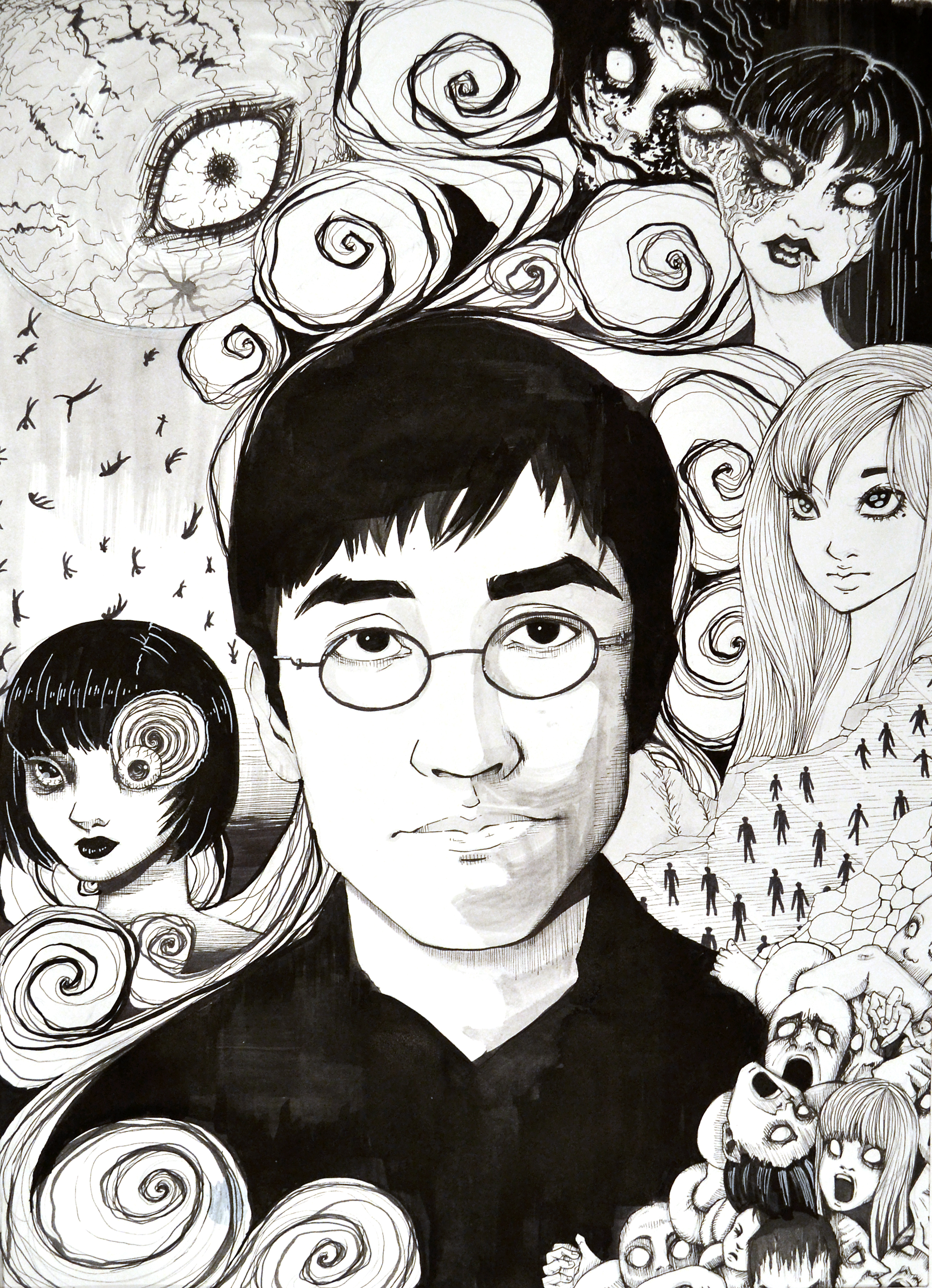
Junji Ito’s portrait is interesting as he surrounds himself with popular images from his works. Not only is he representing how he looks physically, but also his creations which he identifies as part of himself. The ink design references the work he is known for.
Gregory Gillespie was a man who always leaned his art towards the eccentric. His many self-portraits contained what I would describe as an ora of confidence. Not in a cocky way, but in a “this is what it is” kind. I find it personally amazing that despite not being really exposed to art as a child, he had always had an affinity for it. It gives me hope that I can possibly become a greater artist as I get older as well.

Gregory Gillespie’s self-portrait is odd. Everything but his face is highly detailed and almost three dimensional. However, the face feels flat like a board. The dead expression in his eyes contrasts the sillier expression his mouth is making. I get a fun but insane energy from the piece that I can highly appreciate.
MLA Citation
“Bio.” Emilio Villalba, emiliovillalbaart.com/cv/.
“Emilio Villalba | Self Portrait as a Painter.” Artsy, http://www.artsy.net/artwork/emilio-villalba-self-portrait-as-a-painter.
Micchelli, Thomas, and Thomas Micchelli. “‘Insanity, Chaos, Weirdness’: Gregory Gillespie’s Solitary Path.” Hyperallergic, Hyperallergic, 3 Nov. 2015, hyperallergic.com/247516/insanity-chaos-weirdness-gregory-gillespies-solitary-path/.
Revolvy, LLC. “‘Junji Ito’ on Revolvy.com.” Revolvy, http://www.revolvy.com/page/Junji-Ito.
Smith, Roberta. “Gregory Gillespie, 64, an Unflinching Painter.” The New York Times, The New York Times, 29 Apr. 2000, http://www.nytimes.com/2000/04/29/arts/gregory-gillespie-64-an-unflinching-painter.html.
Thacker, Eugene. “Black Illumination: the Unhuman World of Junji Ito.” The Japan Times, http://www.japantimes.co.jp/culture/2016/01/30/books/black-illumination-unhuman-world-junji-ito/#.XKTjQetKh24.


